Interior Details

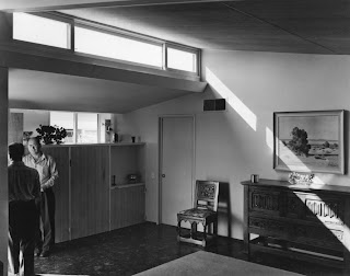
interior gregory ain park planned home - entry way

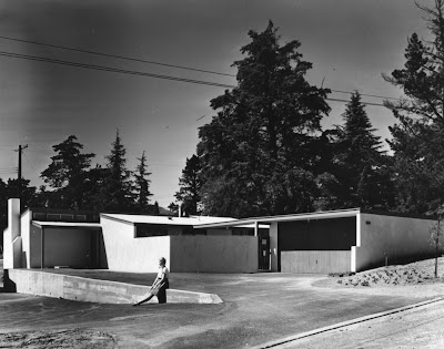
interior gregory ain park planned home - living room
You will likely recognize the top image depicting the entry way and room divider from a post a couple of weeks ago (see the American Builder magazine article). And, although the bottom image may seem familiar, it's not the same photo that was published in the American Builder article or used for the Arts and Architecture display ad. This deja-vu shot shows the same living room with the same furniture, but taken from a different corner of the room. It would be reasonable to assume that these pictures are of the same interior, but when you recognize that the first image with the two men was taken from the vantage point of the living room, it's clear that these are two separate houses.
Some details of note on the entry way photo:
- The two men...? No clue. Neither of them is Gregory Ain.
- 5 ft tall room divider cabinet is the spec version. Some houses on the street had this detail built all the way to the ceiling. The effect was to block out a portion of light from both the east and west sides of the house, depending on which room you were in. It also made the room feel less like the ceiling was floating overhead. I have no actual proof, but I suspect the construction to the ceiling was actually easier and cheaper to complete. This storage feature is largely gone (or heavily altered) from all of the 28 homes today.
- The uplight below clerestories is effectively a metal gutter. In many modernist and moderne homes of the 30s and 40s, you would see this kind of feature built out of wood. It runs the length of the clerestories in the dining room and living room area. Most if not all of the homes still have this feature today.
- The main ceiling is striated plywood, sealed in a natural tone. Only a few homes today still have this feature, and most of these have actually been painted over. With more contemporary aesthetics, the original wood feels quite heavy and busy in such a small space. Those that have removed the wood entirely, replacing it with plaster, are actually achieving a greater sense of space in the room. Ones eyes focus more on the exterior views.
- The cabinet doors also have this same striated plywood. Ain used it here and on the other side, in the breakfast nook area.
- The vent just below the uplight and above the hallway door is one of the termination points for the ingenious built-in ducting of the home. Both heating and air were apparently features of the system, although none of these original units still exist for obvious reasons. There are a few homes that have all new ducting that sits on top of the roof, thereby taking away from the aesthetic of the streamlined roof. It does tend to get hot in Altadena from time to time...
- The floors are 9-inch square asphalt tiles. This one needs to be sweeped...
- The baseboard is not obvious because it is painted a similar color to the tiles, but it was one of the 45-degree angle types, often used in homes by Neutra, Ain, etc., when a trim was required.
- The hallway door also has a trim, which was true of all of the interior doors in the house. Both the courtyard and backyard doors do not have trim, and are more indicative of Ain's innovative economy. (We will see pictures of these another day.)
- You can see one of the tilted windows of the garage opened slightly. That's looking through the window that was just above the kitchen sink.
- That desert painting is in every antique mall and junk shop between Pasadena and Palm Springs. Judging by the number of times I've seen it in said places, it was a pretty popular print.
- I don't think the Keno brothers would care much for the furniture. Come to think of it, Frank Bros. probably would not have liked it much either.
Some details of note on the living room photo:
- The most important detail about this room is the fireplace. This fireplace is on an uphill facing wall. We know this because the hearth is raised off the ground by a three brick stack. All fireplaces whose wall was an uphill wall have this raised hearth (and larger vertical footprint in the room), and all fireplaces where the wall was downhill have a flush hearth (and smaller vertical footprint in the room). Why? Not being an engineer, I can only hazzard a guess, but it's probably a mix of retaining wall requirements, as well as an aesthetic requirement by the architect to make the street view uniform. When facing the homes on the street, each chimney between houses that do not share a common garage wall are exactly the same height. So... from all of that, we know this house is located on the eastern side of the street, with it's front door facing north (up the street). Pretty cool, huh.
- The tile and striated plywood ceiling are more clearly visible here. Also the dark colored walls and contrasting uplight gutter give a real sense of the time.
- The furniture is a bit of an odd mix. The couch looks almost like it could be a Laszlo piece, but it probably is not. The almost incongruous upholstery on the two side chairs, the grass rug that is slightly too small for the room, the pussywillows in the fireplace and the holiday (?) ornaments on the "mantel" makes me think this room was assembled by the photographer and not a designer (but who knows). More likely it's a showcase model for the street, open to potential buyers. In any case, it's pretty great.
- The cabinetry that you see in the corners of the fireplace (that also are shown wrapping into the bookcase in the other angle from this room), are likely Ain spec pieces used as part of a showcase model. Not all houses had a built-in bookcase or storage like this, but there is some evidence in homes higher up on the street that at least bookcases did exist. (The higher up on the street comment referring again to the Esther McCoy noted lumber shortage; it's possible details like this did not get completed as building progressed down the street.)
- There looks to be a lock on the clerestory windows, although it's not clear if this was a feature on every house. I have seen firsthand a weird sash/pully system in some kitchen-side windows (indicating there would have been an easier way than getting on a ladder to open them), but a system like that does not seem evident in this image.
- Check out the sister image from the American Builder article to see what else you can find...
Once again, crossing the boundaries of too much information for one night. If there is one person out there enjoying this, then we're happy. And even if not... still happy.
More to come soon...


Keno brothers!?! haha. Nice read.
ReplyDeleteyou've definitely lost your mind... welcome to the abyss....
ReplyDeleteYou've done such a great job with all of this, I'm loving the detail...
ReplyDelete